US Labor Market

Initial Claims Interactive


Figure 2

Figure 3
17-Feb-2024. How the claims cycles coincide with recessions and S&P500 bear markets? In previous cycles, Initial Claims rising from the bottom of the cycle practically preceded the beginning of the recession and then the bottom on the S&P500. In the current 2022-2024 cycle, Initial Claims increased from the bottom (September 2022) to February 10, 2024 by only 30k (and it took 16.5 months). For example, in the 2006-2008 cycle from the bottom of Initial Claims (28-Jan-2006): - until the recession start, Initial Claims increased by 68k (in 22.5 months), and - to the bottom on the S&P500 Initial Claims increased by 378k (in 37.2 months). In the 2000-2002 cycle from the bottom of Initial Claims (15-Apr-2000): - until the recession start, Initial Claims increased by 134k (in 11 months), - to the bottom on the S&P500 Initial Claims increased by 146k (in 29.8 months), but in this cycle we first had a peak on Initial Claims and only then a low on the S&P500. In the 1989-1991 cycle from the bottom of Initial Claims (21-Jan-1989): - until the recession start, Initial Claims increased by 85k (in 17.7 months), - to the bottom on the S&P500 Initial Claims increased by 153k (in 20.4 months). All the previous 7 cycles are presented in Figure 1. The chart is a bit difficult to read, so Figure 2 shows only the ranges of the (i) beginning of the recession, (ii) the bottom on the S&P500 and (iii) the peak of the Initial Claims upward trend - for each of the last 7 cycles. However, the most interesting is Figure 3, which shows the same as Figure 2, but without the two outliers (in the case of the Initial Claims low, we omit the one from 1981; and in the case of the S&P500 low, we also omit the one from March 2009). The current cycle is closest to the one from 2006-2008, when the Fed's pause was also very long (due to the strong economy). Back then, over 22 months passed from the bottom of Initial Claims to the entry into the recession (the longest of all 7 cycles). In the current cycle, 22 months will end only in July 2024.

2024 vs 2006

2024 vs 2000

2024 vs 1989

2024 vs 1981

2024 vs 1978

2024 vs 1973

2024 vs 1968

2006 timeline

2000 timeline

1989 timeline

1978-82 timeline

1973-75 timeline

1968-70 timeline
US UR August-2023

5-Sep-2023. Why has the US unemployment rate (UR) increased so much? Rising UR is a potential "big deal" for the markets. Especially if it is confirmed in the coming months. Of course, it does not have to have an immediate impact on the markets, but it could be another “macro straw” to complete the current cycle. UR increased in August by 0.29 percentage points from 3.50% to 3.79%. UR is calculated very simply by dividing the number of unemployed by the size of the Labor Force. The number of unemployed increased by 514k in August (this is the largest monthly increase since April 2020 and as a rule such monthly increases do not happen outside of a recession - see charts). The Labor Force grew by 736k persons in August. It is therefore easy to calculate that the increase in the number of unemployed resulted in an increase in UR by 0.31 pp, and the increase of the Labor Force resulted in a decrease in UR by 0.02 pp (details in the table). In practice, a change in the number of unemployed will always be entirely responsible for a change in the UR (since there are 6m of Unemployed and the Labor Force is 168m). Unemployment Level consists of Job Losers, Job Leavers, Reentrants to Labor Force and New Entrants (see chart). In August, Job Losers increased by 294k, Job Leavers decreased by 51k, Reentrants +77k, New Entrants +94k. These numbers are not that essential, their distribution may be more important. Before the recession, one could expect a decrease in the share of Reentrants and Leavers, and an increase in the share of Losers. But about this and whether you can get any “leading” signals from it in the next post…


5-Sep-2023. Why has the US Unemployment Rate increased so much? Part 2. All categories of unemployed (Job Losers, Job Leavers, Reentrants and New Entrants) move more or less together during the cycle. But before and during recessions, the share of Losers (in total unemployed) increases and the share of Leavers and Reentrants decreases (see graphs). Looking at today's situation, one can say that such trends have already started (see next chart). So we are closer to another recession. Job leavers are unemployed people who quit or otherwise voluntarily left their previous job and immediately began looking for new employment. Reentrants are unemployed people who have past work experience but were not in the labor force for a period of time prior to beginning their current job search. New entrants are unemployed people looking for their first job. They have no previous work experience. Job losers consist of the following subgroups: - People on temporary layoff (These are people who have been given a date to return to work or who expect to return to work within 6 months. Unlike the other unemployed subgroups, those on temporary layoff do not need to be looking for work to be classified as unemployed). And People not on temporary layoff (data available since 1967), i.e.: - Permanent job losers (people whose employment ended involuntarily) - data available from 1994, and - People who completed a temporary job - data available since 1994. The last chart shows the breakdown of Job Losers. However, for this data series, the categories generally move similarly throughout the cycle, and it's hard to squeeze any leading signals out of it.


Job-Worker Gap Sep-2023

6-Oct-2023. Job Worker Gap. We can look at the strength of the labor market through the balance of labor demand (available number of jobs) and labor supply (number of available employees). Powell himself spoke about this relationship more than once, and also presented it on a chart (Chart 1). Unfortunately, after the September data, the gap widened to the benefit of employees (read: higher salaries because of higher labor demand, what is bad for inflation). The Job-worker Gap increased by +686,000 in September. The contribution to the increase in the Job-worker Gap in September is: +690k Job Openings, +86k employment growth in September (employment level), -90k an increase in the number of available employees (labor force).


Job-worker Gap Oct-2023

3-Nov-2023. Job-Worker Gap. The labor market is slowly but surely slowing down, also if we look at the job-worker gap - i.e. the difference between demand and supply in the US labor market (this is one of Powell's favorite charts). The Gap decreased in October, but only by 91 thousand people (in September it increased by 573 thousand people). However, the Gap is still above 3 million people, i.e. 3 million people more on demand side than supply! Definitions: Demand (number of available jobs) = Employment Level (number of employees according to Household Survey) + Number of Job Openings Supply (number of available employees) = number of people in the labor force - see chart 1. The job-worker gap decreased by 91,000 in October, of which: +56 thousand change of Job Openings -348 thousand change Employment Level +201 thousand Labor Force change – see chart 2.

US Employment Oct-2023

3-Nov-2023. Employment Situation. X 2023. The 3-month average change in employed persons is negative and amounts to -13k persons (Household Survey). The change in October 2023 was -348k. Payroll employment (number of jobs, Establishmengt Survey) increased in October by only 150k (3-month average change is 204k). See chart 1. Chart 2 – the difference between Payroll Employment and Employed Persons is growing.

US Wage Growth Oct-2023

3-Nov-2023. Employment Situation. October 2023. Wage growth is also clearly slowing down... Powell's 3 favorite series (chart 1): 1) Average Hourly Earnings of All Employees: Total Private: only +4.10% YoY 2) Employment Cost Index: Wages and Salaries: Private Industry Workers: only 4.49% YoY 3) Atlanta FED Wage Tracker - Unweighted Overall: only 5.20% YoY On top, the 3-month average change in “Average Hourly Earnings of All Employees” is only +0.27%, which is exactly the pre-pandemic norm… see chart 2. Average Hourly Earnings of All Employees increased only +0.21% in October.

US Unemployment Oct-2023

3-Nov-2023. Employment Situation. October 2023. Unemployment Rate 0.5 percentage point above the cycle low - this is a big deal! Unemployment Rate U3 in October increased to 3.90%. This is above the 12-month moving average which was at 3.61%. Historically, this has been a strong signal of an impending recession. See chart 1 and 2. Chart 3 shows the cycle of the unemployment rate and the S&P500 cycle simultaneously. Chart 4 shows various measures of the unemployment rate and their increase since recent lows. The Table 1 shows accurate calculations of the unemployment rate and more.


Labor Recession Leading

3-Nov-2023. Employment Situation. October 2023. Selection of leading recession data series from the labor market: 1) Unemployment rate, up 0.5 from the cycle low, strong signal, chart 1 2) Initial claims, up only 20k from the cycle low, no signal right now, chart 2 3) Continued claims, up 462k (+36%) from the cycle low, strong signal, chart 3 4) Average Weekly Overtime Hours Manufacturing, significantly down, strong signal, chart 4 5) Average Weekly Hours Manufacturing, significantly down, strong signal, chart 5 6) Index of Aggregate Weekly Hours Manufacturing, down 1,2% from cycle high, weak signal, chart 6 7) Temporary Help Services Employees, some signal, down from cycle high, but only to pre-covid level, chart 7 8) ISM Manufacturing Employment Index, at 46.8 it’s quite some signal, chart 8.


US vs Canada Nov-2023

1-Dec-2023. US vs Canada Employment. Why wait another week for the U.S. November jobs report? Today we got the Canadian employment report for November. It’s well known that the economies of both countries are closely interconnected. Employment in Canada increased by 24.9 thousand people in November, above expectations of 15.8 thousand (vs. 17.5k in October and 63.8k in September; the 3-month average increase is 35.4 thousand). Figure 1. Figure 2 shows the annual change in employment for both countries since 2000. This increase in employment was enough for the annual employment change to remain at +2.52% (vs. 2.53% in October), while the 3-month annualized employment change dropped from 2.43% to 2.12% - see Figure 3. The unemployment rate increased from 5.7% to 5.8% in November (and is already up +80 bps from the recent low). For comparison, the U.S. unemployment rate is currently 50 bps above the low seen in April this year - Figure 4. Figure 5 shows the unemployment rates of both countries since 1960. We can probably expect a similar, i.e. neutral report in the USA (published on December 8).


US vs Canada UR Nov-2023

8-Dec-2023. US Unemployment Rate (U3). U3 fell to 3.7% in November from 3.9% in October (expected 3.9%). Let's look at the details - Figure 1. The number of unemployed decreased by 215k (point 1 on the Figure 1). The number of employees increased by 747k (point 2). The sum of these two data gives +532k people and the Civilian Labor Force increased by this amount (point 3). The unemployment rate is Total Unemployed / Civilian Labor Force and amounted to 3.74% (point 4). This is a decrease of 14 bps (much less than (after rounding) 20 bps as officially reported by BLS), of which 13 bps is the contribution of the decline in the unemployed and only 1 bps is the contribution of the increase in the Civilian Labor Force. So the decline in the number of unemployed people was critical here (as a rule, it is). Interestingly, we are now only 35 bps above the April 2023 cycle low. In Canada, the unemployment rate has increased by 80 bps since April (Figure 2). Since 1960, the correlation between the U.S. and Canadian unemployment rates has been 0.65 (Figure 3).


Initial Claims Jan-2024

19-Jan-2024. Initial claims have fallen to the bottom of the cycle. Initial Claims fell to 187,000, which is only 5,000 above the cycle low of September 24, 2022. This could indicate a very tight labor market, but this is not necessarily the case. In September 2022, data on initial benefits were also confirmed by Continued Claims (1.302 million vs. today's 1.806 million) and the unemployment rate (3.5% vs. today's 3.7%). Overall, initial claims data is both highly volatile on a weekly basis (including across states), not to mention large differences between the unadjusted and seasonally adjusted series (e.g., unadjusted initial claims were 289k – so more than 100k above adjusted series). On top New York State recently had a spike in initial claims, which are now falling significantly - last week they went up by 20.5k, this week they went down by 17.2k). In any case, the data should be taken with a pinch of salt, which does not change the general conclusion that the labor market is tight and the worst thing is that the situation is currently not deteriorating - which is what the market would expect under the scenario of cutting interest rates. We are also not quite where we were with the labor market in September 2022. The labor market has weakened a bit since then, which is also confirmed by other data series (apart from the data on unemployment benefits). Details in Figure 1. Figure 2 shows the variability of initial claims in New York State.

Jan-2024 Job Report

3-Feb-2024. If you believe all the data from the payrolls report, it would probably be the most important data point in this cycle, but I suggest limiting your faith in this data and, like the market, taking it into account only to some small extent. Why? They are inconsistent with other data, at the same time they are just after major revisions and concern the month of January, when the difference between the unadjusted and the seasonally adjusted series is the largest (e.g. the number of jobs actually decreased in January by 2.635 million - only after the seasonal correction we have an increase of 353k). What attracts attention is the increase in earnings, which could end the narrative about defeating inflation. AHE (average hourly earnings) increased 0.6% in January (expected 0.3%), and the annual change is now 4.5% (expected 4.1%). At the same time, the average number of working hours per week dropped significantly from 34.3 to 34.1 hours (which does not fit well with rising wages... less work means a drop in wages, not an increase, ceteris paribus). Figure 1 shows Powell's favorite series, with the most important being the (quarterly) Employment Cost Index. We still have a long way to go to return to pre-pandemic wage increases (around 3%). Figure 2 shows the decline in the average number of working hours and, at the same time, average weekly earnings (the annual change is at the bottom of the cycle). And the decline in working hours slowly suggests that we are closer to a recession. One of the factors leading a future change in wages may be the number of voluntary layoffs of employees (change of job, e.g. due to receiving a higher salary at another employer). Figure 3 shows the so-called Quits Rate for the private sector. The rate of voluntary quits is currently at pre-pandemic levels, which is one of the factors pointing to a decline in wage growth in the coming months. Bond yields had to react to such data and as a result we had a big bear-flattening of the yield curve, yesterday's yields increased by: 2Y +16bps, 10Y +14bps, 30Y +10bps. As a result, the probability of a rate cut on March 20 is now only 20% (it was 35% before the publication of employment data). Key data ahead of the FOMC meeting on March 19-20 will be: CPI inflation on February 13 and March 12, payrolls for February on March 8, and PCE inflation on February 29. On March 6, we will also get the Quits Rate for January 2024 (JOLTS report). To sum up, we can have limited confidence in such data, but the increase in wages is disturbing. Yet, in the coming months there is a chance that the earnings growth will decline. Such data may not bother the stock markets too much, but the bond markets must take it into account in higher yields (but only temporarily, because there is a chance of a decline in wages in the following months).


Initial Claims Deep Dive

11-Feb-2024. Initial Claims Deep Dive. Initial Claims is one of the best leading indicators on the US labor market. The rapidly rising number of insurance claims (both initial and continued) indicates an imminent recession. To be more certain, we can validate the Initial Claims signal with other data series such as: 1) Continued Claims, 2) Unemployment Rate (monthly), or 3) Challenger Job Cut Announcements (monthly). Generally, all these series confirm the current signal from Initial Claims: we are above the lows of the cycle (the lowest level of Initial Claims was 182k in September 2022), but still too low to talk about a more reliable signal on entering a recession. Figure 1 shows how Initial Claims rhymes with Challenger Job Cut Announcements, Figure 2 shows the same but zoomed in. The increase in the announced Job Cuts in January to the level of 82.3k confirms the increase in Initial Claims from the level of 189k (January 13) to 227k (January 27), and the latest data is 218k (February 3). Figure 3 shows Initial and Continued Claims and the unemployment rate in one chart.


11-Feb-2024. Initial Claims Deep Dive. Part 2. How the claims cycles coincide with recessions and S&P500 bear markets? In previous cycles, Initial Claims rising from the bottom of the cycle practically preceded the beginning of the recession and then the bottom on the S&P500. In the current 2022-2024 cycle, Initial Claims increased from the bottom (September 2022) to February 3, 2024 by only 36k (and it took 16.5 months). For example, in the 2006-2008 cycle from the bottom of Initial Claims (28-Jan-2006): - until the recession start, Initial Claims increased by 68k (in 22.5 months), and - to the bottom on the S&P500 Initial Claims increased by 378k (in 37.2 months). In the 2000-2002 cycle from the bottom of Initial Claims (15-Apr-2000): - until the recession start, Initial Claims increased by 134k (in 11 months), - to the bottom on the S&P500 Initial Claims increased by 123k (in 29.8 months), but in this cycle we first had a peak on Initial Claims and only then a low on the S&P500. In the 1989-1991 cycle from the bottom of Initial Claims (21-Jan-1989): - until the recession start, Initial Claims increased by 85k (in 17.7 months), - to the bottom on the S&P500 Initial Claims increased by 122k (in 20.4 months). All the previous 7 cycles are presented in Figure 1. The chart is a bit difficult to read, so Figure 2 shows only the ranges of the (i) beginning of the recession, (ii) the bottom on the S&P500 and (iii) the peak of the Initial Claims upward trend - for each of the last 7 cycles. However, the most interesting is Figure 3, which shows the same as Figure 2, but without the two outliers (in the case of the Initial Claims low, we omit the one from 1981; and in the case of the S&P500 low, we also omit the one from March 2009). The current cycle is closest to the one from 2006-2008, when the Fed's pause was also very long (due to the strong economy). Back then, over 22 months passed from the bottom of Initial Claims to the entry into the recession (the longest of all 7 cycles). In the current cycle, 22 months will end only in August 2024.


US JOLTS Report Mar-2024

4-Mar-2024. Awaiting February 2024 employment data. The labor market is the key to rate cuts, lower inflation, and a bull market at the long end of the UST curve. On Friday we will get the data for February, but earlier on Wednesday we will get some leading labor data in the JOLTS report (Job Openings and Labor Turnover Survey). What to look for? Quit rate for the Total Private is of particular interest. The quit rate is a proxy of worker bargaining power. It can be treated as a leading indicator of wage inflation - see Figure 1. Quit rate is the number of voluntary departures from work in a given month to the total number of employees. The highest quit rate is currently in the Leisure and Hospitality industry (4.3%), and the lowest... in the Government sector (0.8%). Over the last 6 months, the number of private jobs in the US increased by 1,191,000 (total private, see Figure 2). Of this: 557 thousand in Private education and health services, 195 thousand in Leisure and hospitality, 116 thousand in Construction, and 112 thousand in Professional and business services. The JOLTS report also provides data on Job Openings. If the vacancy rate falls, it means less employment growth in the future. Vacancy rate is the number of job openings to the number of employees. Figure 3 and 4 show the vacancy rates for Total Private, Private education and health services, Leisure and hospitality, Construction and Professional and business services. In recent months, only in the case of Leisure and hospitality there has been a significant decline in vacancy rate - this may indicate a further relatively strong employment growth in the coming months... let's see what data we get on Wednesday…


Payrolls move markets!

7-Mar-2024. Payrolls report can move the market. Tomorrow we will get the employment data for February. The market expects +200k (in the range of 125-286k - Refinitive consensus). Payrolls report is probably the only data (apart from CPI) that can practically move the market - at least the rates/bonds market. Figure 1 shows the 1st tier data - i.e. CPI Inflation and Payrolls for the last two months against the 10-year US Treasury bond yield. The reading for December was already hawkish, and in January the labor market was really red hot - both in the number of new job addition and in terms of wage inflation – see Figure 2. Other data, also important for the debt market, do not have such a significant impact on the change in the trend in 10-year bond yields – see Figure 3. Yesterday, the JOLTS report showed a small decline in Job Openings for the entire market (total private, vacancy rate was unchanged as a result). Yet what the market "didn't notice" was that vacancy rates increased in 3 of the 4 sectors responsible for the largest employment growth in the monthly employment report (Figure 4) - the labor market remains quite strong… Today we got the next Initial Claims data (no major changes) and the Challenger report (also unchanged vs January - but the level of layoffs is relatively high: 84.6k in February vs 82.3k in January) – see Figure 5.


US Labor Market Feb-2024

9-Mar-2024. US February employment key takeaways. A month ago, when commenting on the January employment data, I suggested not to trust the data (link: https://www.jamkaglobal.com/post/subjective-market-review-3-feb-2024 ) and this turned out to be dead on accurate… just look at strong revisions of the January data (downward change in payroll employment from 353k to 229k). But the market usually reacts to "nominal" data anyway. Just look at the change in 10Y yield after the publication of January data (Figure 5). The employment report contains a very large amount of various data and statistics that can be analyzed for hours. But not to lose the big picture, from the point of view of market reaction - 80% of the contribution is made up of only three data points: (1) the increase in the number of payroll jobs, (2) wage inflation and (3) the unemployment rate. The remaining countless data can/should also be analyzed, but should generally fit into the remaining 20% of market impact. Below is a summary of key data for February: 1) Payroll job growth is strong (hawkish), +275k in February, 3m av. +265k – see Figure 1; 2) Wage growth has slowed down (now neutral, after being strongly hawkish last month); Figure 2 and 3. 3) The unemployment rate has jumped to 24-month high (dovish/strongly dovish) - Figure 4. I present a summary of employment data in a chart showing the change in 10Y yield – see Figure 5. “Net net” the employment data is neutral/goldilocks-like. What's next? The market's attention will now shift to inflation for February - publication on Tuesday, March 12. Headline CPI is expected to rise +0.4% M/M in February (prev. +0.3%), while the core rate of inflation is expected to rise +0.3% M/M (prev. +0.4%). Cleveland FED inflation nowcast indicates headline CPI at +0.43% M/M and core +0.32% M/M.


U3 up 50bps - Feb-2024

9-Mar-2024. Could recession be imminent? U3 is 50bps above its lowest 12m value! One of the popular indicators of an upcoming recession may be an increase in the unemployment rate (U3) above the 12-month moving average - see Figure 1. U3 is currently 50bps above the cycle low and 22bps above its 12m average! More details in Figure 2. Below details per first month of recession: Feb-2024: U3 = 4.90% (12m av. = 3.68%) Feb-2020 (recession begins): U3 = 3.50% (12m av. = 3.62%) Dec-2007 (recession begins): U3 = 5.00% (12m av. = 4.62%) Mar-2001 (recession begins): U3 = 4.30% (12m av. = 4.02%) Jul-1990 (recession begins): U3 = 5.50% (12m av. = 5.33%) Mar-1981 (recession begins): U3 = 7.40% (12m av. = 7.46%) Jan-1980 (recession begins): U3 = 6.30% (12m av. = 5.88%) Nov-1973 (recession begins): U3 = 4.80% (12m av. = 4.88%) Dec-1969 (recession begins): U3 = 3.50% (12m av. = 3.49%) Apr-1960 (recession begins): U3 = 5.20% (12m av. = 5.27%) Even if the 12m average was above U3 in the first month of the recession, U3 increased significantly within a few months... giving a strong signal of a recession (as in the case of 1990, 1981, 1980, 1973, 1969, 1960). A second approach could be to check the history for a U3 increase of 50bps above its lowest value in the last 12 months. Interestingly, it is rare for U3 to be 50 bps above preceding 12-month low outside of a recession - see Figure 3.


US Labor Market Mar-2024

7-Apr-2024. Strong at face value, but not so much under the hood. US March Payrolls. The market usually pays more attention to the month to month change in employment data, but several leading series indicate lower both wage and new jobs growth in H2 2024... My key takeaways from recent data: 1) Challenger layoffs are quite elevated recently… third month in a row around 80-90k – see Figure 1, 2) Despite high employment growth, the annual change in wages is the lowest in 3 years, and the Quits rate (from the Jolts report) indicates a further decline in wage inflation in the following months - see Figure 2, 3) NFIB Small Business Hiring Plans Continue to Decline, now at 11% net – the lowest level in 4 years – Figure 3 i Figure 3a, 4) The unemployment rate dropped in the US from 3.9% to 3.8% (exactly by only 3bps from 3.86% to 3.83%), and in Canada it's the other way around... - Figure 4. Since the bottom of the cycle, the unemployment rate in Canada has increased by 110 bps, and in the USA only 40 bps. Figure 5 shows a high correlation in the unemployment rates between the US and Canada.


US Labor Market Apr-2024
5-May-2024. US Labor Key Charts – update. My bunch of leading charts from a month ago on the US labor market hit the mark! Link to that post: https://www.jamkaglobal.com/post/strong-at-face-value-but-not-so-much-under-the-hood Challenger layoffs, Quits rate, NFIB Small Business Hiring Plans, Canada unemployment rate - all of them came really leading... And in the subsequent month we have a higher unemployment rate, lower wage inflation, and weaker job growth… It's time to update those charts - since they seem to work... The most important data, i.e. wage inflation... we have a drop to 3.92% YoY in the case of AHE (average hourly earnings, total private), in addition the Quits rate dropped even lower in the next month (March 2024, JOLTs report) - see Figure 1. Bonus chart: Quits rate vs Effective Fed Funds Rate… it looks very interesting - Figure 2. NFIB Small Business Hiring Plans has good leading properties... in April we have a drop in payrolls to 167k (total private), NFIB rebounds to 12% in April - see Figure 3. The U3 unemployment rate increased in the US to 3.9% in April - which is consistent with the strongly rising unemployment rate in Canada - Figure 4. Data for April in Canada will be available on May 10. However, other data do not fully confirm the rising unemployment rate: Challenger Cuts decreased in April (Figure 5), and Initial Claims do not increase at all, similarly to Continued Claims.. Figure 6. All-in-all, this is good news for risky assets - we are moving a bit towards the Goldilocks scenario... falling wage inflation and slightly slower labor market growth... Bonus Chart - Historically, rising unemployment rates have indicated an impending recession... see Figure 7.


US Labor Market May-2024

8-Jun-2024. Fed Funds Rate vs U3. Will the rising unemployment rate (U3) force the Fed to cut rates sooner? The FED's decisions are generally not based on economic variables - which can be proven by the lack of high correlation between the FED rate and the main economic variables, or even various variants of the Taylor rule. With this in mind, will the rising unemployment rate be too hard to ignore in an election year? Historically, the Fed has been quick to cut interest rates whenever the unemployment rate begins to rise - at least in recent non-inflationary cycles - see Figure 1. In 2019, the Fed didn't even wait for the unemployment rate to bottom out... see Figure 2. In 2007, it was enough for the unemployment rate to increase from the bottom of the cycle by only 30 bps and we already had the first cut - see Figure 3. And even at the time of the first cut, the unemployment rate was only 20 bps above the cycle low (in August 2007 U3 was 4.6% ). In 2001, the first cut occurred with the unemployment rate only 10 bps above the cycle low - see Figure 4. And what is the situation today? The unemployment rate is already 60 bps above the cycle low (53 bps unrounded - see Figure 5). Since the bottom of the cycle, i.e. from April 2023, the number of unemployed people has increased by 934,000 and the number of people not-in-labor-force has increased by 750,000 in the same period. If we see a further increase in the unemployment rate in the next 2-3 months, this may be a strong argument for the Fed to lower rates sooner rather than later... Table 1 presents key data series from the US labor market. Table 2 is the same data, but it exhibits monthly changes. The last row of Table 2 shows the cumulative change since the cycle low (since the U3 trough in April 2023). And so during this period: Population +1,805,000 Labor Force +1,054,000 Unemployed +934,000 Employed +121,000 (only!) Not in labor force +750,000 Table 3 shows, among other things, the calculation of the unemployment rate.


Canada Labor May-2024

9-Jun-2024. Canada Employment vs BoC key interest rate. The unemployment rate is rising not only in the US, but also north of the US border. In Canada, the unemployment rate rose to 6.20% in May (Figure 1). At the same time, the Bank of Canada has already reduced the interest rate to 5.75% (from 6.00%) - Figure 2. Nevertheless, the unemployment rate has increased in Canada since the bottom of the cycle by as much as 120 bps (from April 2023), and in the USA by only 60 bps. Employment growth in both countries is similar - if we compare YoY changes - see 3 and 4. But inflation in Canada is currently less of a problem compared to the US - see Figure 5 and 6.


Global Demography Part 1

16-Jul-2024. It's demography, stupid. Potential GDP growth is the sum of the change in productivity and the change in population size. A growing population therefore means higher potential GDP growth. Descending population means lower GDP growth. According to the UN projection, China's population will decrease by 160 million people by 2050, and by as much as 790 million people by 2100. This is more than a 55% decline compared to 2024 levels. See Figure 1. In the case of China, the population decline by 2050 is "only" 11.3%. It will be much worse in Japan (-15.1% by 20250 - see Figure 2) and in Poland (-14.9% by 2050 - see Figure 3). By 2050 the decline will be: - in Italy 12.6% (Figure 4) - in Germany 7.4% (Figure 5) - across Europe 6.6% (Figure 6) - in Spain 6.2% (Figure 7) But there are countries where the population will grow until 2050: - India +15.9% (+220 million people, Figure 8) - USA +8.6% (+30 million people, Figure 9) - France +2.5% (+1.7 million people, Figure 10) Bonus charts, in one chart: - China and India – Figure 11 - Europe and USA – Figure 12


Global Demography Part 2

16-Jul-2024. It's demography, stupid. Part 2. GDP growth is negatively affected not only by population decline, but also by population aging. Why is the aging population also important? Older people simply spend less. This is clearly visible in the data on American consumer spending by age - see Figure 1. Consumers aged 50 spend, on average, 96% more than those aged under 25. Similarly, consumers over the age of 75 spend over 40% less than those aged 50. These are actual data for 2022. The worst situation is when the share of older people in the total population increases and the share of people aged 25-50 decreases. According to the UN projection, Poland and China will be in the worst situation in this respect. See Figure 2 and 3. India, the USA and France are in the best position. In France, the share of people aged 25-49 will even increase by 2050 (but it is the only such country). See Figure 4, 5 and 6. The remaining countries fall in the middle, by 2050 the increase in the share of people over 65 will be in percentage points: - in Europe +8.01pp, see Figure 7 - in Germany +7.09pp, see Figure 8 - in Spain +14.9pp, see Figure 9 - in Japan +7.7pp, see Figure 10 - in Italy +12.2pp, see Figure 11


US Labor Market Jun-2024

8-Jul-2024. Unemployment Rate 4.1% - this is a big deal! The main takeaway from the June labor market is the increase in the unemployment rate to 4.1%, i.e. 70 bps above the cycle low (3.4%). This is a big deal from a macro point of view, however the S&P500 does not care and on the day the unemployment rate rose to another cycle peak - it also set its own all-time high. How has the S&P500 dealt with such a situation historically - as a rule, the rising unemployment rate sooner or later marked a peak in the index. Then, a further increase in the unemployment rate resulted in declines in the S&P 500 - see Figure 1. As a rule, a stronger increase in the unemployment rate also means the occurrence of a recession. Evidently, this time investors are not worried yet and are counting on a soft landing. Interestingly, during the previous soft landing in 1995, the unemployment rate only increased by 40 bps (April 1995) and then began to decline further... Yes, it was a real soft landing. Figure 2 shows the S&P500's returns during consecutive bull markets starting near the top in the unemployment rate. In two cases (1987 and 2022) we had a bear market without a recession and without a cycle in the unemployment rate.


US Labor Market Aug-2024

8-Sep-2024. Does a slowing job market mean recession? Another nervous week on the markets is behind us, additionally with weak data from the US job market. The market is "panicking", but the best summary of what happened on Friday I read on zerohedge: "The schizophrenic market tries to decide if it wants a 25bps cut, a 50bps cut, and weather it prefers a soft or a hard landing." While the market is "panicking", this does not apply to the Fed. At least for now, the Fed does not intend to give in to emotions and cut rates by 50 bps on September 18 - but only by 25 bps. You could say that the Fed is taking a calm approach to the data, and not only today's, but over the past year... The Fed did not overreact (by cutting rates) to low inflation readings in 2H2023, did not overreact (by raising rates) to high inflation readings in 1H2024, and should not overreact to recession fears (e.g. by cutting rates by 50 bps on September 18). The market got spooked by the slowing labor market, which is mainly visible in (1) falling monthly job growth (establishment survey, CES), and (2) rising unemployment rate (household survey, CPS). CES provides much more reliable data due to a much larger sample (119,000 businesses and government agencies, representing about 629,000 individual workplaces). The approximate size of over-the-month change in employment required for statistical significance at the 90-percent confidence level for CES is +/-130k. For CPS, however, it is as much as +/-600k (sic!). So let's look at how the labor market has historically slowed down in previous cycles. Figure 1 shows the annual, 6-month and 3-month change in employment according to CES survey. We are indeed slowing down now, but +1.51% YoY change… means that we are either already in recession (like in 1990) or we are 29 months away from recession… like in 2017 – see Figure 2. +0.62%.. 6-month change… means that we are either already in recession (like in 1990) or we are 25 months away from recession… like in 2017 – see Figure 3. +0.22% 3-month change… - see Figure 4. It is not a good idea to look at a 3-month change, but for the full analysis… we are between 7 months and 18 months away from recession. All-in-all, the labor market is slowing down, but: - firstly, one shouldn't look at just one data series to conclude whether we are already in a recession (only a holistic view can be helpful here), - secondly, a slowing labor market is not the best tool for timing a recession (the history of recent cycles suggests that we are either already in a recession or we will be in it in 2.5 years), - and in a sotf-landing scenario, like in 1996 - when the labor market also quickly slowed down and the Fed also started cutting rates - the 2001 recession was still... try... 5 years away 😊.


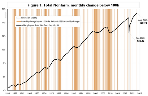
Slowing Labor Market Aug-24

9-Sep-2024. Slowing Labor Market, part 2. Another way to look at a slowing labor market is to check how many monthly changes in employment are below 100k. Figure 1 shows when the monthly change was below 100k (or, to be precise, below 0.063% of monthly change - so that historical numbers are comparable to today's absolute employment level). Indeed, the July 2024 reading (after revisions) shows the first print below 100k since December 2020. Should we be worried? Figures 2 and 3 show that, for example, there were more such readings in 2018 and 2019. Especially since July 2018, the monthly variability of the data has increased.. indicating that one-month data can be misleading… e.g.: January 2019: +258k February 2019: +5k March 2019: +227k April 2019: +308k May 2019: +38k


Labor Market Sep-2024

7-Oct-2024. Hot payroll report! Will there be more hot reports in the near future? We have one more CPI report, one PCE report, and one NFP report (that is, Employment Situation for October, which will be released on November 1!) until the November 5 election. The NFP report for September was hot, but it is only one month. The next month (October) may be more difficult to interpret, as the report may be distorted due to strikes and the hurricanes. Key takeaways from the September NFP: (1) The 3-month average change in jobs jumped from 116k (August) to 140k (August, after revision) and 186k in September! See Figure 1. So a 70k M/M jump for 3-month average! Big deal. (2) the annual change in wages jumped from 3.63% (July) to 3.97% (September), but this does not look convincing against the other similar data series – see Figure 2. The labor market from the perspective of the employee (i.e. Quits Rate) is certainly not hot! – see Figure 3. (3) the unemployment rate fell to 4.1%. A rising unemployment rate has historically preceded recessions. Are we approaching a recession.. we can look at how much the unemployment rate has increased from the lowest level in the last 12 months (Figure 4), or from the bottom of the cycle (Figure 5). Figure 6 shows the change in the unemployment rate from the bottom for the 2023-2024 cycle. An increase from the bottom of 0.9 pp is a big deal, but also a drop of 0.2 pp could be the deal. If next month we drop by next 0.1 pp to 4.0 – that could potentially mean an end to upward unemployment move. So history (of the unemployment rate) suggests that we should be in a recession, but consumers are not reducing their spending, and businesses are still creating new jobs, and the unemployment rate has started to decline (although it's only been two months of decline, so we are not more certain that the trend has reversed). As for the upcoming CPI report (published on Thursday, October 10), the market expects headline CPI to rise +0.1% M/M in September (prev. +0.2%), and the core rate is seen cooling to +0.2% M/M (prev. +0.3%). Cleveland FED Nowcast expects headline CPI +0.11% M/M, and core CPI +0.27%. The PCE report will not be out until October 31. In the meantime, Retail Sales will be announced on October 17.


Labor Market Oct-2024

2-Nov-2024. Chaos in the markets? What game are the markets playing? Especially after the publication of the US October employment report. Overall, it looks like there is some chaos... Why chaos now? We have a culmination of many outsize risks, be it the elections, the Fed meeting, extremely weak data from the labor market (hurricanes, strikes, negative revisions) vs. the narrative of a strong US economy and the return of inflation. In addition, we had a sharp decline in stock markets on the last day of October.. As for the labor market, the next report for November may be key... (published on December 6), then we will see whether the weak data for October will be confirmed... the labor market is clearly weakening, but the data is also very volatile from month to month – as it was similar at the end of the cycle in 2019 - see Figure 1. Weaker labor market data affected the GDP forecast for Q4.. The Atlanta GDP tracker already indicates only +2.3% (GDP) and +2.6% consumer spending (PCE) in Q4 - see Figure 2 and 3. The increase in 10Y yields to 4.39% is intriguing! With a weak labor market and falling oil prices – such a combination is rarely seen.. (see Figure 4). Interestingly, the reaction to an increase in employment of only 12k (+10 bps on the day of publication, full-day change) was similar to a month ago to an increase of 254k... (+12 bps on the day of publication - October 4) – see Figure 5. If the increase in yields is a continuation of the "Trump trade" effect... then it is not consistent with, for example, the simultaneous decline of DJT.US (Trump Media & Technology) by 13% on Friday and a total of 41% for the last three days... Figure 6. All in all, the market will (hopefully) get more clarity after the elections and the FOMC meeting next week. In the case of the labor market, one can only hope for more clarity after the publication of further data... culminating in the next most important report on December 6 (employment situation for November).


Labor as a Recession Signal

9-Dec-2024. How to avoid a recession signal form labor market? The labor market continues to look good, although the number of employed (Household Survey) fell by 355 thousand people in November, which means a YoY decrease of 0.45%. Such an annual dynamics of this series has historically always meant a recession – see Figure 1. However, other data series do not yet indicate a recession. See Figures 2 and 3. The annual dynamics of the number of jobs (Establishment Survey) is still 1.45%. For Total Private it is 1.33%, and for public employees as much as 2.13%. Such a large discrepancy in data between two surveys is very rare – see Figure 4 – and is probably not related to the business cycle. However, if we look at the annual dynamics of the number of jobs in Total Non-farm and Total Private (establishment survey), we are slowly approaching a recession... at least when it comes to the annual dynamics of these series - see Figure 5. For Total Non-farm Payrolls, the decline in the annual dynamics to 1.45% meant: in 2019, 29 months to recession (29 months to the peak on the S&P500), in 2007, 11 months to recession (8 months to the peak on the S&P500) in 2001, 3 months to recession (we were already 9 months past the peak on the S&P500) in 1990, minus 1 month (we were already 1 month past the peak on the S&P500). For Total Non-farm Private Payrolls, the decline in annual dynamics to 1.33% meant: in 2019, 6 months to recession (6 months to the peak on S&P500), in 2007, 9 months to recession (6 months to the peak on S&P500) in 2001, 2 months to recession (we were already 10 months past the peak on S&P500) in 1990, 1 month to recession (1 month to the peak on S&P500). Soft landing story: Interestingly, in the context of the last soft landing in 1995-1996... annual dynamics dropped then only to 1.81% for Total Private... now we are much lower... only at 1.33%. How to avoid recession: To avoid recession signals e.g. from Total Private, then monthly Total Private should grow at least 200 thousand per month for the next 6-7 months in a row…. For Total Non-farm it would be 240 monthly.. And to confirm the “soft landing” as in 1996, these monthly increases should be much higher.


Payroll Revisions

9-Feb-2025. Lost in payroll revision? Together with the data on employment situation in January 2025, we also got the annual benchmark revisions. Why is an annual benchmark revision needed? Just … "to reflect comprehensive counts of payroll jobs for March 2024. These counts are derived primarily from the Quarterly Census of Employment and Wages (QCEW), which counts jobs covered by the Unemployment Insurance (UI) tax system". Net net, right now payrolls seems to be neutral in the short term. The GDP growth forecast for Q1 according to the Atlanta GDP Now model has not changed after taking into account the latest employment data (the GDP forecast is still +2.9%, but the growth of PCE consumer spending has fallen from 3.0% to 2.8%, and at the same time we have a higher growth of Investments (GDPI), which after the employment data increased to 6.2% (from 5.2%). But in the medium term the employment revision is negative, because the labor market is definitely weaker. Figure 1 shows the change in the employment level, Figure 2 the change in monthly changes, and Figure 3 the change in the 3-month averages. The change in the annual change looks the weakest... for December 2024 it was +1.42% before the revision, and only +1.27% after the revision - which means that we are closer to a potential recession/slowdown. See Figure 4. Figure 5 shows the monthly change in payrolls (after the revision), it is worth paying attention to the large decrease in the monthly change (from 307k in December to 143k in January).


